Monday, 30 December 2013

Close Up Nurse Face

After creating the walking cycle, I decided I want to try out a different animation test and this test is a close up of the Nurse face. This shot is suppose to be from the kids point of view when he see her for the first time. For my research I looked at characters who looked similar to the Nurse character, I've watched a few episode of the animated series of Jonny Bravo to observe how the women facial expression are made when the character Jonny sees them for the first time and has a crush on them.


I have also watched a few episodes of the animated series of Scooby Doo Mystery Incorporated I thought the character Daphne looked similar to the Nurse Character and I notice a close up Daphne face when she was signing on a stage. By looking at the images I have snap shot images from an episode it was helpful to see how Daphne would slowly close and open her eyes in each shot.

This is my first attempt of the close up Nurse face. I thought this animation didn't really work because it looked unnatural and the smile wasn't quick enough.

This is the second test I think it looks slightly better because, I've changed the lips so she would smile before her eyes are open. Therefore I think this animation worked well as the facial expression look natural.

I have then tried out different test as this time I've only animated her eyes so she would blink but her lips would stay the same and smiling all the way.

However I didn't really like the the lips because it seems to look rather large on her face so for this fourth animation test I've changed her lips so now its slightly smaller. Brett and I discussed about these close up test and we both thought this fourth test worked the best. However we also talked about the size of her face as it would probably work better if her face is a little closer.
  
I then used this test to created a slow motion test as I wanted to see if it would work better if the animation was in slow version.


Finally I then changed the size of the face so now it is slightly zoomed in as I have mentioned above that me and Brett wanted the face to be zoomed in so her shoulders wouldn't be showed. 


For this test I think it's improved because her face is zoomed in a lot so, hopefully this will make her eyes be the main focus in this scene. I have enjoyed creating these animation test but there are still improvements need to be made such as, trying out backgrounds effects or either having a pink background which makes the school Nurse look beautiful and irresistible to be missed. 
Below is an image I've print screen from the animated series of Dexter Laboratory. The character Mandock sees Dee Dee for the first time and falls in love with her appearance. This is the style I want the background to be similar to because with it being pink and having stars around her it makes her seem like shes sparkling.

Nurse Animation Test

Lately I've been working on some animation tests, I started off with the character of the Nurse and this is my first walking cycle of the Nurse.

I am quite satisfied with this animation test as I like how I've animated her with the way her body bounces as well as her head when she walks. The Nurse character suppose to appear very fine looking and feminine. So I've created another animation test but this time I've animated her arms so she would look lively and even more feminine.

I'm quite pleased with this second animation because I think it worked well. I've animated her arms so it would move at the same time as her legs. However the Nurse character is based on Dexter's mother in the animated series of Dexter Laboratory.
In my research I have notice the way Dexter's mother walks is slightly different compare to my Nurse character because when she walks, her bottom half of her body moves while her top half stays the same. Below are some images I have copied and paste from an episode so it can help me observe the way she walks.
I have created this third animation test based on Dexter's mother walk. I thought my research was very useful as I could see how each step would come across.

For this fourth test I've added more key frame for each step so she would walk slightly slower. 
Overall I'm quite pleased with my the Nurse walking cycle. I've learnt how important the way a character can show their personality by just observing the way they walk. By looking at the fourth animation test I could see the difference compared to the first two because now she comes across more feminine as well as being elegant. Where as the first two she appears very cheerful and youthful. However there are still improvements need to be made as I still have to add the background so I could correct the size as well the timing.


Thursday, 12 December 2013

Final Two Close Up Painitngs


The background has been changed

We have changed the angle of the felt tip pen as we thought the first one looked unrealistic so we just edited the pen so it was placed behind the hand. We now think it looks much better because the way the hand and the pen is positioned looks more realistic.

My Close Up Detailed Paintings

My first close up digital painting.

This is the second painting Brett has changed the hand slightly so the ketchup would fit in-between the fingers better.

Final painting of the ketchup close up i had to repaint the hand by using a different brush tool on Photoshop so the blending of the painting looks better.


This is my third painting but this time its a close up of the character holding a felt tip pen. I don't really like the painting so me and Brett decided to use the same painting for the ketchup. 

I don't really like the painting so me and Brett decided to use the same painting for the ketchup. 


I have also tried out different back grounds but we have chosen the fourth background as we thought it would be best suited to the look of the film.

Close Up Detailed Painting Research

In Brett's film there will be a few close up detailed painted shots he asked me to paint a few scenes. before i start the painting these are my research of close up detailed painting these images are from cartoon Sponge Bob Square Pants.


Final Development for Branches Lightning Flash Style

I have neaten up the lightning flash and played around the colours as well as changed the brightness of the background so it will be darker when the flash goes off the scene.


Final one!


Branches lightning style developments

First Branches lightning style, there are still changes need to be develop. 

Second development I have used a different colour for the outline of the flash.

Third development, again i've changed the outline colour.


Fourth development, this is the same as the 3rd test however I have made the flash faster.


Development of Lightning Test


For this development of lightning flash I have just changed the colours. 


Wednesday, 11 December 2013

Second Lighting Test

This is my second lightning test, I have changed the style of the lightning flash and also the background.


First Lightning Test


First lightning test created on flash 

Research For Lightning Effect For Brett's Film

We watched an episode of dexter's laboratory we screen shot the style of lightning we want in the film the first image is a simple lightning shape and the second one is slightly shaped like tree branches.


Thursday, 14 November 2013

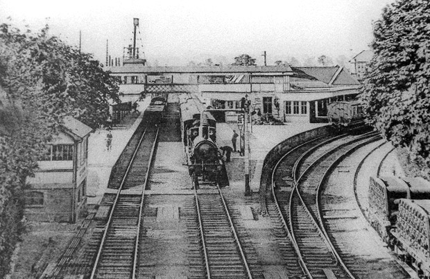
Zoe's Victorian Train Station Concept Art.

This is a mood board I created with all the images I found on internet as well as images from Zoe.


Research of Victorian train stations


I did some quick thumb nail sketches.


This is a practise research work, I painted and drawn over a photo.

A quick observational drawing.


With all the research images on internet I have created my own Victorian train station concept layout however this is an idea of my designs. Therefore some of the drawings are quite rough.


Zoe and I discussed about this layout she then wanted some changes, she wanted less arches in this layout and add some Victorian windows, doors and benches I also said I will add some lights in this drawing so below are some images Zoe found on internet with the style of windows and benches she wanted the design to be.

https://www.ukaa.com/stockimages/3351_0.jpg


https://www.ukaa.com/stockimages/3351_1.jpg

http://www.allaboutprops.com/images/inventory/inventoryph-office/Bench%20-%20park%20nice_md.jpg


http://farm3.staticflickr.com/2437/3638764768_409284f483_o.jpg

http://www.annapolisexperience.com/blog/wp-content/uploads/2012/01/CommercialVictorianWindowConduitStJan2nd2012.jpg


My Victorian Train Station Lights research


Victorian Lighting


After my research of all the objects Zoe and I have discussed to add on my layout design I have briefly redrawn the layout and changed parts of my layout design.


I have also drawn a rough idea of another layout of a Victorian Train Station from a different angle.


Brett's Film Nurse Character Walking Cycle

A quick sketch of the nurse character walking cycle, by drawing this sketch it could help me with the animation.


Brett's Film Nurse Action Pose.

The nurse turn around.
The Nurse action pose


The Final Layout For Brett's Film

We have chosen to have the rectangle chairs and I have also changes some of the colours and neaten up the edges.


With Backgrounds


Saturday, 9 November 2013

Developed layouts for Brett' film.


Two desk layouts to choose from as we haven't decided to have a round chair or a square chair.


Different Camera angle for a different scene